
In This Article
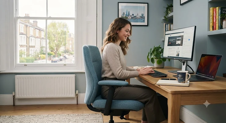
There’s a particular moment familiar to anyone who’s ever sat down at a beige desk, in a beige chair, under grey lighting — a small, quiet sag in energy before you’ve even opened your laptop. It’s easy to write off as nothing. But the growing body of research into colour and cognition suggests that what’s directly beneath you all day genuinely does shape how alert, calm or restless you feel while working. Office chair colour for productivity isn’t just an interior design trend; it’s a question with a surprising amount of psychological research behind it.
This guide is built on honest, sourced comparison rather than marketing colour-wheel clichés. We’ve researched seven real office chairs currently sold in the UK, spanning budget mesh chairs available in multiple shades through to premium designer chairs offered in more than a dozen colourways, and we’ve weighed up what the research on colour psychology actually says about each. Whether you’re building a productive workspace colours scheme from scratch, researching colour-coded productivity for a shared team office, or simply trying to decide between blue and green for your next chair, you’ll find grounded, evidence-aware analysis here rather than vague superlatives.
We’ll also cover the genuine psychological research behind colour and performance, the difference between what marketing blogs claim and what peer-reviewed studies actually show, and the mistakes people make when picking office furniture colours. Every claim about colour psychology below is either drawn from published research or clearly flagged as design convention rather than proven science.
What Is Office Chair Colour Psychology?
Office chair colour psychology is the study of how the colour of your seating and surrounding furniture influences mood, arousal and cognitive performance during work. Genuine peer-reviewed research, most notably work led by psychologist Andrew Elliot, has found that specific colours like red can measurably affect performance on cognitive tasks — see Wikipedia’s overview of colour psychology for the broader academic context behind this field.
Quick Comparison Table
| Chair | Colour Range | Price Range | Best For |
|---|---|---|---|
| Vinsetto Ergonomic Mesh Office Chair | Grey, black, pink variants | around £90-£150 | Budget colour experimenting |
| SONGMICS Flocking Fabric Chair (OBG41L) | Saturated green | around £50-£90 | Calming budget accent piece |
| Yaheetech Ergonomic Mesh Office Chair | Grey, multiple accents | around £80-£130 | Entry-level neutral base |
| SIHOO M18 Ergonomic Office Chair | Black, silver mesh | £170-£230 range | Mid-budget focus-oriented setup |
| Steelcase Series 1 | 7+ colours (blue, red, beige, grey, brown) | £499-£599 range | Serious colour-matched office |
| Ergohuman Elite G2 | 12 mesh colourways | £750-£970 range | Premium intensive-use seating |
| Herman Miller Sayl | 16 colourways | £750-£950 range | Design-led statement workspace |
Looking at the spread above, the gap between the sub-£150 chairs and the Herman Miller Sayl isn’t really about colour range alone — cheaper chairs typically offer two or three fixed colourways per model, while premium designer ranges let you fine-tune the exact saturation and shade. If you’re weighing this up primarily on genuine colour choice, note that the Ergohuman Elite G2 sits in a useful middle ground: twelve mesh colourways at a price considerably below the Sayl’s full custom-build options.
💬 Just one click — help others make better buying decisions too!😊
Top 7 Office Chairs for Productivity by Colour: Expert Analysis
1. Vinsetto Ergonomic Mesh Office Chair — cheapest way to experiment with colour
The standout feature here is genuine colour choice at a budget price — most sub-£100 mesh chairs come in black only, but this range offers grey, black and pink variants across its different models. Key specs include a breathable mesh back, adjustable seat height, a five-star swivel base, and a maximum load capacity of around 120-150kg depending on the specific model.
Based on the spec comparison with pricier chairs, the honest trade-off here is build longevity rather than comfort on day one — reviewers consistently report that the chair feels comfortable and well-priced initially, but a recurring theme in aggregated feedback is that padding can compress noticeably within the first year of regular use. What most buyers overlook about a budget colour-variety chair like this is that it’s a genuinely low-risk way to test whether a lighter or more saturated seat colour actually changes how you feel at your desk, before committing to a premium chair in the same shade.
Pros:
- ✅ Genuine colour choice at a sub-£150 price point
- ✅ Breathable mesh back for all-day comfort
- ✅ Straightforward flat-pack assembly
Cons:
- ❌ Padding can compress within the first year
- ❌ Lighter-duty frame than premium alternatives
Typically priced around £90-£150 depending on the specific model and colour, this is the chair to consider if you want to test a colour theory before spending serious money.
2. SONGMICS Flocking Fabric Chair (OBG41L) — best budget pick for a calming green accent
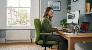
The standout feature is the genuinely saturated lemon-green flocking fabric finish, a distinctly different proposition from the grey and black chairs that dominate the budget end of the market. Key specs include a five-star stainless steel base, foam padding over a flocking fabric surface, an adjustable height range of roughly 48-55cm, and a compact seat and backrest designed for home office use.
Aggregated review sentiment consistently praises the shade itself, with several long-term owners specifically describing the green as “soft and unobtrusive” rather than garish, and multiple reviewers report the fabric holds its colour well over time. Based on the spec comparison with grey and black alternatives at a similar price, green is worth genuine consideration here — it’s one of the few colours with reasonably consistent research support for reducing eye strain during long screen-based sessions, making it a sensible pick for anyone doing heads-down focused work. The trade-off, as with most budget fabric chairs, is a lighter frame and shorter expected lifespan than mesh alternatives.
Pros:
- ✅ Distinctive, well-reviewed saturated green finish
- ✅ Genuinely low price point for a colour-forward chair
- ✅ Compact footprint suits smaller home offices
Cons:
- ❌ Fabric rather than more breathable mesh
- ❌ Lower weight capacity than premium alternatives
Priced around £50-£90, this is a strong entry point for anyone specifically wanting to test green as a calming accent colour without a big outlay.
3. Yaheetech Ergonomic Mesh Office Chair — reliable neutral base for building a colour scheme
The standout feature is a genuinely ergonomic mesh design at an accessible price, positioning this as a sensible neutral base chair around which you can build a more colourful desk and accessory scheme. Key specs include breathable mesh backing, a comfortably padded seat, adjustable lumbar support on most models, and a swivel base with smooth-rolling casters.
Here’s what to weigh with a neutral-toned base chair like this: rather than trying to make the chair itself the colour statement, several interior designers recommend using a grey or black chair as an anchor point and introducing colour through desk accessories, wall art or a feature cushion — a strategy this chair supports well given its clean, unobtrusive design. Reviewers consistently describe the ergonomic adjustments as solid for the price point, with several long-term owners specifically noting good lumbar support during extended work sessions, though a recurring theme in feedback is that armrests on some models feel less sturdy than the rest of the frame.
Pros:
- ✅ Genuinely ergonomic mesh design at a low price
- ✅ Neutral tone suits a colour-accent strategy elsewhere
- ✅ Solid lumbar support for the price point
Cons:
- ❌ Armrests feel less sturdy than the main frame
- ❌ Limited colourways compared with premium ranges
Typically priced around £80-£130, this is a sensible pick for anyone who wants to introduce colour psychology into their workspace through accessories rather than the chair itself.
4. SIHOO M18 Ergonomic Office Chair — best mid-budget pick for focus-oriented work
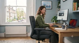
The standout feature is genuine ergonomic sophistication at a mid-budget price, with a choice between black and silver-toned mesh finishes that lean toward the cooler, calmer end of the spectrum research associates with sustained focus. Key specs include an S-shaped backrest designed to mirror the spine’s natural curve, adjustable lumbar support, 3D armrests, and a breathable high-back mesh construction.
Based on the spec comparison with cheaper alternatives, the S-shaped backrest and genuine 3D armrest adjustment are the features that most clearly separate this from sub-£100 chairs — reviewers consistently report noticeably better long-session comfort than budget alternatives, with several long-term owners specifically highlighting the lumbar support as effective rather than just a marketing bullet point. Aggregated feedback does flag occasional armrest damage on arrival, though sellers have generally been responsive in sending replacement parts, and the cooler-toned colour options suit the calmer, focus-supporting palette that much of the available research favours for concentrated work.
Pros:
- ✅ S-shaped backrest genuinely mirrors spinal curve
- ✅ Cooler-toned colours suit focus-oriented work
- ✅ 3D armrests with real adjustment range
Cons:
- ❌ Occasional armrest damage reported on arrival
- ❌ Limited colour range compared with premium chairs
Priced in the £170-£230 range, this sits as the mid-budget pick for anyone prioritising genuine ergonomic support alongside a calmer, focus-supporting colour palette.
5. Steelcase Series 1 — best all-rounder for a colour-matched professional office
The standout feature is a genuinely wide colour range — over 30 back, seat and frame combinations spanning black, blue, red, grey, beige, white and brown — from an established commercial furniture brand, at a price considerably below Steelcase’s higher-tier chairs. Key specs include LiveBack technology that mimics the spine’s natural movement, 4D armrests adjusting in height, width, depth and pivot, weight-activated tilt tension, and a lifetime warranty on the structural frame.
Based on the spec comparison with budget chairs, the genuine engineering difference here is LiveBack technology, which changes shape dynamically as you move rather than staying rigid — this is a meaningfully different proposition from the fixed backrests found on the chairs earlier in this list. Reviewers consistently praise the chair’s compact footprint relative to its adjustability, with several long-term owners specifically noting it fits smaller home offices better than bulkier ergonomic chairs, while aggregated feedback highlights the 5-6 week production lead time as the most common practical drawback of ordering a specific colour combination.
Pros:
- ✅ Genuine LiveBack spine-mimicking technology
- ✅ Over 30 colour and finish combinations available
- ✅ Lifetime warranty on the structural frame
Cons:
- ❌ 5-6 week production lead time for made-to-order colours
- ❌ Requires flat-pack self-assembly on arrival
Priced at around £499-£599 including VAT, this is the strongest all-round pick for anyone who wants genuine colour choice backed by serious commercial-grade engineering.
6. Ergohuman Elite G2 — premium pick for intensive daily use in your chosen shade
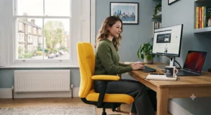
The standout feature is a genuinely extensive palette of 12 mesh colourways alongside a choice of black or grey frame, positioning this as one of the more colour-flexible options in the premium ergonomic category. Key specs include a split-back design with dedicated flex zones for continuous lumbar support, a dual-pivot synchro mechanism with recline locking, 5D adjustable armrests, and a height-adjustable pivoting headrest.
Here’s what to weigh with a chair engineered to this standard: the split-back flex-zone design is a genuinely different approach from single-panel mesh backs, designed specifically for people spending eight or more hours in the chair daily, and this is reflected in its Greenguard Gold indoor air quality certification and compliance with BS 5459 for continuous 24-hour use. Reviewers and long-term owners consistently praise the single-lever control system for simplifying what would otherwise be a confusing number of adjustment points, and the 10-year warranty on all parts signals real manufacturer confidence, though the standout drawback is that a made-to-order colour outside the standard stock options can extend delivery to several weeks.
Pros:
- ✅ 12 mesh colourways with a black or grey frame choice
- ✅ Greenguard Gold certified for indoor air quality
- ✅ 10-year warranty covering all parts
Cons:
- ❌ Non-stock colours can extend delivery time
- ❌ Premium price reflects intensive-use positioning
Priced at around £750-£970 depending on configuration, this is the pick for anyone spending genuinely long daily hours in the chair who wants both ergonomic depth and real colour choice.
7. Herman Miller Sayl — the design-led statement chair for colour-conscious workspaces
The standout feature is sheer colour breadth: 16 distinct colourways including Berry Blue, Green Apple and Studio White, designed by Yves Béhar with an unframed suspension back inspired by the Golden Gate Bridge. Key specs include the 3D Intelligent suspension back that flexes to individual body movement without a rigid frame, a posture-contoured seat, adjustable lumbar support, and a choice of base and arm configurations.
Based on the spec comparison with every other chair on this list, the genuinely distinctive engineering here is the unframed back — rather than mesh stretched over a solid frame, the Sayl’s back flexes as a single connected structure, which is both the source of its striking visual silhouette and part of why it won the Best of Year Product award in its category. Reviewers and designers consistently highlight the chair’s ability to make a genuine style statement in an office while still delivering credible ergonomic support, and Herman Miller’s research and design pedigree over more than a century lends real weight to claims about deliberate, considered colour engineering rather than decoration for its own sake. The trade-off is unavoidable: this is a premium designer chair, and the price reflects that positioning.
Pros:
- ✅ 16 genuinely distinct colourways available
- ✅ Award-winning unframed suspension back design
- ✅ Backed by over a century of design research
Cons:
- ❌ Firmly premium pricing for the category
- ❌ Some configurations require a longer lead time
Priced from around £750 up to roughly £950 depending on base, arms and colour configuration, this is the chair for anyone who wants their office chair colour choice to be a genuine, considered design statement.
Practical Usage Guide: Building a Productive Workspace Colours Scheme
Getting productive workspace colours right in the first month of setting up a new office or desk area makes a genuine difference to how the space actually feels to work in. Start by choosing one dominant colour for your largest surfaces — typically the chair and desk — and treat everything else as an accent; a common first-month mistake is trying to balance three or four equally saturated colours, which tends to create visual noise rather than a calming or energising effect. If you’re aiming for a focus-supporting palette, research consistently points toward cooler, less saturated tones like blues and greens as sensible defaults, while reserving small, deliberate pops of a warmer colour like orange or yellow for areas associated with creative brainstorming rather than deep concentration.
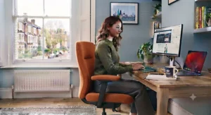
For ongoing refinement, live with a new colour scheme for at least two to three weeks before making further changes, since initial novelty can make almost any new colour feel briefly energising regardless of its actual psychological effect. Pay attention to natural light in the room, since colour saturation reads very differently under daylight compared with artificial lighting, and a shade that felt calming in the shop can feel flat or dull under fluorescent office lighting. A genuinely common oversight is focusing entirely on wall colour while ignoring the chair and desk surface directly in your eyeline for most of the working day — given how much time is spent looking at or sitting in it, the chair itself is arguably a higher-leverage colour choice than the walls.
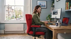
Real-World Scenarios: Matching Chair Colour to Your Work Type
Consider three genuinely different working profiles. First, a software developer doing long stretches of deep, focused coding work with minimal interruption — here, the calmer, cooler tones of the SIHOO M18 Ergonomic Office Chair or Steelcase Series 1 in blue or grey make sense, since the available research on colour and cognitive performance generally favours cooler, less arousing tones for sustained concentration tasks.
Second, picture a creative director or designer whose work genuinely benefits from bursts of energy and idea generation throughout the day — the Herman Miller Sayl in a brighter colourway like Green Apple or Berry Blue suits this profile well, since the workspace itself can become a source of visual stimulation rather than something to tune out. Third, imagine someone setting up their very first proper home office on a tight budget, who wants to test whether colour genuinely affects their mood and focus before committing serious money — this is exactly the scenario the SONGMICS Flocking Fabric Chair or Vinsetto Ergonomic Mesh Office Chair were priced for, letting you experiment with a saturated shade like green without a large financial commitment. Matching the chair’s colour and tone to the actual demands of your work, rather than simply picking whatever looks best in a product photo, is the single most useful piece of advice in this guide.
Problem → Solution: Common Office Chair Colour Mistakes Solved
Problem: I chose a bold colour that now feels overwhelming after a few weeks. This is a well-documented pattern — highly saturated colours can feel exciting initially but become fatiguing with constant daily exposure; consider a less saturated version of the same hue, or reserve the bold colour for an accent cushion rather than the whole chair.
Problem: My office feels flat and uninspiring despite a neutral colour scheme. Research consistently associates bland beige, white and grey environments with lower reported energy and higher reported sadness compared with colour-enriched spaces; introducing even one deliberately chosen accent colour, such as a green or blue chair, can measurably shift how a neutral room feels.
Problem: I can’t decide between blue and green for a focus-heavy role. Both are generally supported by available research as calming, focus-friendly tones; the more practical distinguishing factor is usually personal association and the amount of natural light in your specific room, so trialling a lower-cost chair in each shade before committing to a premium option is a sensible approach.
Problem: My team keeps disagreeing about shared office colours. This is a genuinely common workplace issue; the CIPD’s guidance on workplace wellbeing highlights that a good working environment is one of several core domains of employee wellbeing, so involving the team in the decision, even informally, tends to produce better buy-in than a single top-down colour choice.
Problem: I’m worried a red chair might be a bad idea for my desk. This concern has genuine research backing — published work by psychologist Andrew Elliot has found that brief exposure to red before a cognitively demanding task can measurably impair performance, so red is generally worth avoiding as a dominant colour in a focus-heavy workspace, though it can work well as a small, deliberate accent.
How to Choose an Office Chair Colour for Productivity
- Identify what kind of work the chair mostly supports. Deep-focus roles generally favour cooler, calmer tones; creative or collaborative roles can tolerate, and may benefit from, warmer accent colours.
- Check the room’s natural light before committing. A colour that looks calming under daylight can read very differently under artificial office lighting.
- Consider saturation, not just hue. A muted sage green and a highly saturated lime green trigger noticeably different responses despite both technically being “green.”
- Test on a budget chair before buying premium. Chairs like the Vinsetto or SONGMICS options let you trial a colour cheaply before investing in a Steelcase or Herman Miller equivalent.
- Avoid red as a dominant colour for concentration-heavy work. Published research specifically links red exposure to impaired performance on demanding cognitive tasks.
- Balance the chair against your existing desk and wall colours. A striking chair colour against a similarly bold wall can create visual competition rather than harmony.
- Give a new colour scheme genuine time before judging it. Novelty effects can make almost any new colour feel briefly positive regardless of its longer-term impact.
Bold Colours vs Neutral Tones: Which Wins for Focus?
The core distinction between bold, saturated office chair colours and neutral tones comes down to arousal level and personal tolerance for visual stimulation. Bold colours like a saturated orange or red genuinely increase physiological arousal and can feel energising in short bursts, but the available research, particularly Andrew Elliot’s work on red and cognitive performance, suggests this heightened arousal can tip into impaired focus on demanding tasks. Neutral and cooler tones, by contrast, are generally associated with calmer physiological states that better support sustained concentration, though taken to an extreme, entirely neutral environments have been linked in research to lower reported energy and higher reported sadness compared with colour-enriched spaces.
Cost is a secondary consideration here: bold designer colourways, such as those on the Herman Miller Sayl, often carry the same price as neutral options within the same range, so colour choice rarely needs to be a budget trade-off once you’ve settled on a chair. For genuinely focus-heavy roles — coding, writing, detailed analysis — the evidence leans toward calmer blues, greens and muted tones as the safer default. For roles requiring bursts of creative energy or client-facing presence, a considered, moderate-saturation accent colour can genuinely support the work rather than undermine it. Neither approach is universally “correct”; the CIPD’s factsheet on wellbeing at work notes that a good working environment is just one of several interacting domains that shape overall employee wellbeing, so colour is best treated as one lever among several rather than a silver bullet.
Common Mistakes When Choosing Office Furniture Colours
The most frequent mistake in any office furniture colour guide is treating colour choice as purely aesthetic, disconnected from the actual type of work being done at the desk — a vivid red accent chair might look striking in a product photo but works against sustained concentration for detail-heavy tasks. The second common error is over-saturating an entire room; even genuinely calming colours like blue or green can become visually fatiguing if applied at full intensity across walls, desk, chair and accessories simultaneously, with no neutral space for the eye to rest.
Buyers also frequently underestimate how differently a colour reads under artificial lighting compared with natural daylight, leading to disappointment when a chair that looked perfect online or in a showroom feels different once installed under office lighting. A subtler mistake is ignoring personal colour associations entirely in favour of generic psychological guidance — research provides useful population-level tendencies, but an individual’s personal history with a specific colour can meaningfully override the general pattern. Finally, many buyers skip testing a colour cheaply before committing to a premium chair, when a budget option in the same general hue can validate the choice for a fraction of the cost before a bigger purchase.

Colour-Coded Productivity: Features That Actually Matter (And Those That Don’t)
Colour-coded productivity systems, where different colours are deliberately assigned to different work zones or task types, genuinely have some research grounding, though the effect sizes reported in the literature are generally modest rather than dramatic. Where this genuinely matters: using a consistent, deliberate colour distinction between a focus zone (cooler tones) and a collaboration or break zone (warmer tones) can provide a useful psychological cue that reinforces the intended use of each space, and this is a well-established principle in workplace and interior design more broadly. A chair’s colour, being the object you interact with most directly and for the longest continuous periods, is a genuinely higher-leverage colour-coding choice than, say, a single wall or piece of art.
Where marketing language tends to outrun the underlying science: claims that a specific named colour will reliably boost productivity by a precise percentage should generally be treated with real scepticism, since Andrew Elliot’s own academic review of colour and psychological functioning explicitly notes that research on colour and psychological functioning remains at what he describes as a “nascent stage of development,” and recommends patience and caution around real-world application claims. Genuinely useful colour-coding tends to be simple — two or three deliberately distinct zones rather than an elaborate system — and consistency in application matters considerably more than the specific colours chosen.
Long-Term Value: Workplace Colour Impact on Wellbeing and Retention
The workplace colour impact of a well-considered scheme extends beyond daily mood into longer-term outcomes like employee wellbeing and, by extension, retention and engagement. The CIPD identifies “good working environments” as one of five core domains contributing to overall employee wellbeing, alongside health, values and principles, collective and social aspects, and personal growth — placing physical environment, which includes colour choices, on genuinely equal footing with factors like management style and workload in shaping how people experience their work.
Investment in this area doesn’t need to be dramatic to matter: a single well-chosen accent chair, rather than a full office refit, can be a meaningful and low-cost first step toward a more intentional colour environment. When you weigh the modest cost difference between, say, a neutral grey chair and a considered blue or green equivalent against the potential wellbeing benefit over years of daily use, the case for genuine colour consideration — rather than defaulting to whatever’s cheapest or already in stock — becomes considerably stronger, particularly for roles involving many hours of daily seated concentration.
The Psychology of Office Design: What the Research Really Shows
It’s worth being genuinely honest about the state of the evidence here, since much of what circulates online about the psychology of office design overstates the certainty of individual claims. The most rigorous, peer-reviewed research in this area comes from psychologist Andrew Elliot and colleagues, whose study on red and performance attainment found that brief exposure to red before a cognitively demanding task measurably impaired performance across four separate experiments, with the effect occurring outside participants’ conscious awareness. This is a genuinely robust, replicated finding rather than a marketing claim — but it’s also narrower than the sweeping statements often made about “productive colours” online.
Elliot’s own broader academic review, published in the journal Frontiers in Psychology, is candid that the wider field of colour psychology remains at an early stage of scientific development, with many popular claims about specific colours and specific productivity percentages going considerably beyond what the underlying research actually supports. The honest, evidence-aware takeaway is this: avoiding red as a dominant colour in concentration-heavy environments has genuine research backing; broader claims about blue making you exactly a certain percentage more productive should be treated as reasonable design convention rather than settled science. Choosing a calming, considered colour for your office chair is still a sensible decision — just one grounded in a mix of solid initial evidence and sensible design principle, rather than definitive proof.
FAQ
❓ Does office chair colour really affect productivity?
❓ What's the best office chair colour for focus and concentration?
❓ Should I avoid red office furniture entirely?
❓ How do I choose office furniture colours for a shared team space?
❓ Is colour-coded productivity a proven system?
Conclusion
Choosing between these seven chairs really comes down to an honest assessment of your work type, budget and how much genuine colour choice matters to you. If you want to test colour psychology cheaply before committing serious money, the Vinsetto Ergonomic Mesh Office Chair and SONGMICS Flocking Fabric Chair let you experiment for a modest outlay. If you’re building a genuinely colour-matched professional office with serious ergonomic backing, the Steelcase Series 1 and Ergohuman Elite G2 offer real colour range alongside credible engineering. And if a considered, design-led colour statement matters as much as the sitting experience itself, the Herman Miller Sayl remains the benchmark choice, backed by genuine design pedigree rather than just marketing language.
Whichever direction you lean, treat colour as one genuinely useful lever among several rather than a magic fix, avoid red as your dominant tone in focus-heavy spaces, and give any new colour scheme a few honest weeks before judging whether it’s actually working for you. The right office chair colour for productivity won’t transform your output overnight — but a considered choice, grounded in real evidence rather than marketing claims, can genuinely support how you feel at your desk every single day.
✨ Don’t Miss These Exclusive Deals!
🔍 Take your workspace to the next level with these carefully selected office chairs. Click on any highlighted item to check current pricing and availability. The right colour and chair combination could help you build the focused, energising workspace your productivity deserves!
Recommended for You
- Leather vs Fabric Office Chair: 7 Honest Picks Tested (2026)
- Eco-Friendly Office Chair Mat: 7 Best Non-Toxic Picks for 2026
- Best Office Chair Mat UK 2026: 7 Durable Floor Protectors Reviewed
Disclaimer: This article contains affiliate links. As an Amazon Associate, I earn from qualifying purchases. If you purchase products through these links, we may earn a small commission at no additional cost to you.
✨ Found this helpful? Share it with your friends! 💬🤗
